Tag Archives: BMCC

Week #4

IBM by Paul Rand

Week 4 – The Principles of Design / Layouts and Visual Relationships

Need to review Week#3? Go here.

Using a Grid Format – Gestalt, Contrast, Repetition, Alignment & Proximity

Did you complete Part 1 of the Elements of Design Assignment? Lets take a look. Class Presentations & Discussion.

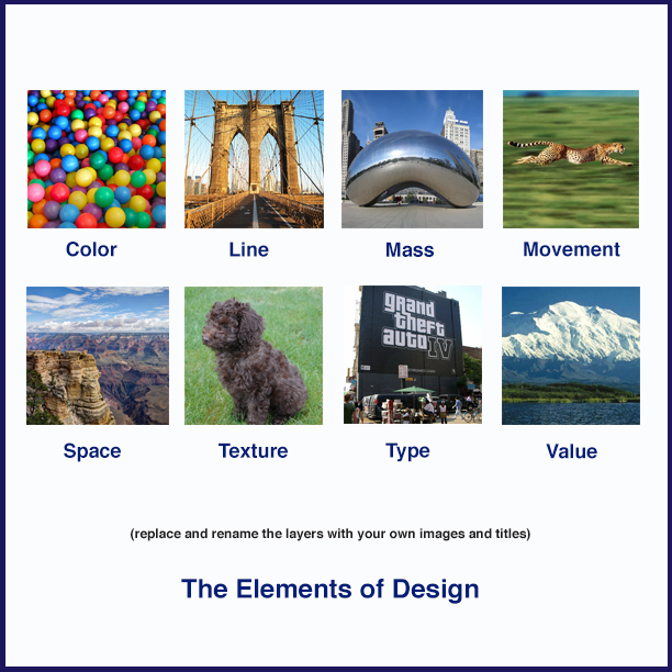
**Need a visual example of Part 1 of the project? Check here

Class Exercise: Assignment #2 – Part 2

Working with Photoshop. Lets apply additional layers, filters and image manipulating techniques to customize our progress. Class demonstrations.

Working from the original psd. document / template that you have created in part 1 of this assignment, students will use and apply additional layers to enhance and manipulate their image selections for the Elements of Art.

Outcome – Students will save two variations of the project as a photoshop psd. file as well as exporting the files as a .jpeg for the web (demonstration in class) Students will also print out a CMYK .jpeg version of the project as well.

Assessment of the project: How has illustrating the vocabulary with images helped your understanding of each term? Discussion.

Color Theory Continued – What did you think of the links posted last week on Color Theory? Let’s dig in deeper this week. (Image via Arhaus‘  via Justcreative)

The link below was published via – JustCreative.com – This is great guide to understanding color in design with an emphasis on logos, identity and branding.

http://justcreative.com/2018/02/19/color-psychology-in-logo-design-branding-explained/

I highly recommend visiting and learning from JustCreative.com aka – Jacob Cass – Jacob is an amazing graphic designer and conduit of great design resources.

Video Screenings –

Photoshop Tutorial – The top 10 Things photoshop Beginners Want To Know How To Do

I love and recommend Terry White’s Youtube channel. He is an Adobe software wizard! Subscribe here.

Who is Michael Bierut and Why is he important? Please watch the video outside of class this week and respond in the comments section below. This is mandatory)


What is GESTALT and why is it important in Design? An introduction.

https://www.canva.com/learn/gestalt-theory/

Assignment #3 – Part 1:

The Principles of Design – Working with and applying color to the principles of design – Continued layout, composition and peeking into adobe Illustrator.

Assignment Specifications: Students will generate a series of visual examples and solutions to define, communicate and illustrate the vocabulary of the Principles of Design. Each term will display an example of : Balance, Contrast, Direction, Economy, Emphasis, Proportion, Rhythm & Unity.

Size: – Students will determine the size of the layout – The final design may be a composite of 8 shapes composed and arranged onto one single page.

Process: 

Part 1 – Student will first create a layout based on research and investigation via the Internet and class resources. Each term for the principles of design will be illustrated by cutting, formatting and placing an example into a composition. (the example from last week is one example, you can create your own)

Part 2 – Students will generate their own examples of each term using techniques learned in class with both photoshop and adobe illustrator.

R&D – Where will you find visual inspiration and research?

Students should conduct research! (and not select only one image) Build a small repository of images and references! We will discuss this in class – generate or organize a series of thumbnails using pencil and a sketchbook (or their preferred method) to brain storm and illustrate their process.

Production:

Students will prepare their final works for both print out put in (CMYK) as well as presentation and application on the web (RGB).

Due dates for next week: We will be working on and completing part 1 of this project in class  2/21 and moving on to part 2 next week.

Please re-review the vocabulary below.

The Principles of Design

The principles of design are applicable to all design disciplines including – but not exclusive to – architecture, art, graphics, fashion, industrial design, poetry, writing, and web design.

The principles of design are tools used to format the elements of design.

Balance – The elements of design converge to create a design or arrangement of parts that appear to be a whole with equilibrium.

Contrast – The “automatic principle.” Whenever an element is placed within a format, contrast is created in the various elements. Can be emphasized with contrast in size, shape, color,

Direction – Utilizing movement to create the visual illusion of displacement.

Economy – A principle operating on the “slim.” Especially important when dealing with clients, where their product or service is more important than the elaboration of design elements. Can also be considered “precise,” or “simplistic.” Or, it can be considered great design.

Emphasis – Also known as dominance. This condition exists when an element or elements within a visual format contain a hierarchy of visual importance.

Proportion – A two- or three-dimensional element defined by other elements of design.

Rhythm – A recurrence or repetition of one or more elements within a visual format, creating harmony.

Unity – Oneness, Harmony, The condition of completeness with the use of all visual elements within a format.

Week #3

Icons by Susan Kare

Week #3

Lets recap on Week#2 – class information and assignment? Go here.

Postcard Presentations! Assignment #1 is Due. Lets talk about screen presentations and printing formats – Class critique of the completed first project.

Assignment #2 – Part 1 & 2

Assignment Specifications: Students will generate a series of visual examples and solutions to communicate and illustrate the vocabulary of the elements of design. Each term will display an example of : Color, Line, Mass, Movement, Space, Texture, Type & Value.

Size: – 8.5″ X 8.5″ – The final design will be a composite of 8 squares composed and arranged by each student.

Process: 

Part 1 – Student will first create a layout based on research and investigation via the Internet and class resources. Each term for the elements of design will be illustrated by cutting, formatting and placing the example into a composite. (the example below is one example, you can create your own)

Part 2 – Students will generate their own examples of each term using techniques learned in class with both photoshop and adobe illustrator.

R&D – Where will you find visual inspiration and research?

1 – Thumbnail sketches – Students should generate a series of thumbnails sketches using pencil and their sketchbooks (or their preferred method) to brain storm and illustrate their process.

Production:

Students will prepare their final works for both print out put in (CMYK) as well as presentation and application on the web (RGB).

Due dates for next week: We will be working on and completing part 1 of this project in class  2/14. Part 2 will be due on Wednesday 2/21/18.

Blank Template example of the layout. (not including the border around the image)


The Principles of Design

The principles of design are applicable to all design disciplines including – but not exclusive to – architecture, art, graphics, fashion, industrial design, poetry, writing, and web design.

The principles of design are tools used to format the elements of design.

Balance – The elements of design converge to create a design or arrangement of parts that appear to be a whole with equilibrium.

Contrast – The “automatic principle.” Whenever an element is placed within a format, contrast is created in the various elements. Can be emphasized with contrast in size, shape, color,

Direction – Utilizing movement to create the visual illusion of displacement.

Economy – A principle operating on the “slim.” Especially important when dealing with clients, where their product or service is more important than the elaboration of design elements. Can also be considered “precise,” or “simplistic.” Or, it can be considered great design.

Emphasis – Also known as dominance. This condition exists when an element or elements within a visual format contain a hierarchy of visual importance.

Proportion – A two- or three-dimensional element defined by other elements of design.

Rhythm – A recurrence or repetition of one or more elements within a visual format, creating harmony.

Unity – Oneness, Harmony, The condition of completeness with the use of all visual elements within a format.


What is Color Theory? The Color Wheel – Lets talk color!

Useful Articles on Color Theory: We will be discussing more on Color Theory & its application this week!

(Please respond to one of the articles below in the comments section) 

https://medium.com/gravitdesigner/an-easy-approach-to-color-theory-and-graphic-design-8b9287c95e42

https://www.blackbeardesign.com/understanding-color-the-meaning-of-color/

https://www.creativebloq.com/colour/colour-theory-11121290

Who is Aaron Draplin??

Logos by Aaron Draplin

Designer Inspiration? Who’s who in the field?

50 Graphic Designers We all Should Know About 


Photoshop Postcard Template Link – Example

Dear MMA100 Students,

Are you looking for a photoshop psd. file / template-example to format and submit your postcard assignment? (feel free to edit and change the layers as you need to) Go here –– https://www.dropbox.com/s/4qtdhum6hpj2jxf/Post%20Card%20Project%20Photoshop%20Template.psd?dl=0

You will need to display both sides of the postcard in one single document. Front & Back.

**All Students will e-mail their finished Postcard assignment to me as a jpg. file [email protected] or [email protected] by Wednesday 2/14 at 5:30pm

Did you miss week #2 and its information Review it here.

Did you miss week #1 and its information  Review it here.

Week #2

Week 2 – The Elements of Design:

We began our course and first assignment / project here in MMA 100 last week and will start our second class by reviewing the thumbnails, roughs and comps individually generated by the class. We will discuss the critique process and presenting our thumbnails, roughs and comps in the group setting. 

Did you miss week #1 and its information, including assignment #1 (Part 1)? Review it here.

We will spend the second half of our class time working on part 2 of the Postcard project. We will get familiar with our work stations, get started with adobe photoshop, electronic imaging, scanning / photo documenting images and artwork, creating and working with various file types and bringing our roughs & comps into photoshop to produce the finished design.

Are you looking for a photoshop psd. file template example to create, format and submit your postcard? (edit and change the layers as you need to) Go here –– https://www.dropbox.com/s/4qtdhum6hpj2jxf/Post%20Card%20Project%20Photoshop%20Template.psd?dl=0

**All Students will e-mail their finished Post card assignment to me as a jpg. file [email protected] or [email protected]

Did you find research materials and examples for the Postcard project? 

Here are a few more reference examples – Click here

Vintage Postcards   – and here are tons of NYC World’s Fair Postcard examples 

We have a huge selection of OER Resources on our class resources page here too

*This Week’s Exercise – Cutting out Images in Photoshop / Making Graphic Assets: Cutting out images in various fragments is a task that all graphic designers will face on a regular basis. Learning various methods for cutting out images is a necessity. We will explore, experiment and share a few methods on how. 

Students will select and practice from 2-3 images from a public domain, OER or creative commons sources on the Internet or they may use images that they have on their devices. Again, We have a huge selection of OER Resources on our class resources page here too

(This technique will be applied to the post card project if necessary).

Video Screening: Cutting out images in Photoshop (examples)

These tutorials above will help get you started with our class exercise, but ultimately, you will need to master the pen tool in both photoshop and illustrator for the cleanest vector cut outs. The video below is a great tutorial.

(Is there a specific tutorial that you learned from recently or over time? Share the URL link with a description of your experience in the comments section below)

Elements of Design: 

The Elements & Principles of Design are the governing vocabulary that define, illustrate and communicate how Graphic Design functions all around us. We will start with the Elements.

Color – typically known as hue. This word represents a specific color or light wavelength found in the color spectrum, ranging circularly from red to yellow, green, blue and back to red.

Line – is a line just a series of points? Or is it the best way to get from point “A” to point “B”? As a geometric conception, a line is a point in motion, with only one dimension – length. Line has both a position and a direction in space. The variables of line are: size, shape, position, direction, number, interval and density. Points create lines, lines create shapes or planes and volume.

Mass – Here, mass is interchangeable with volume. A mass is a solid body or a grouping of visual elements (line, color, texture, etc.) that compose a solid form. Volume is a three-dimensional form comprising length, width, and depth. Three-dimensional forms contain points (vertices), lines (edges), and planes (surfaces). A mass is the two-dimensional appearance of a three-dimensional form.

Movement – Also known as motion. This element portrays the act or process of changing place or direction, orientation, and/or position through the visual illustration of starting or stopping points, blurring of action, etc. This is not animation, although animation is an end product of movement, as well as other elements of design.

Space – A two-or three-dimensional element defined by other elements of design.

Texture – A technique used in two-dimensional design to replicate three-dimensional surfaces through various drawing and media techniques. On three-dimensional surfaces, it is experienced by touch or by visual experience.

Type – Also known as typography, and it is considered an element in graphic design. Although it consists of elements of design, it is – in itself – often an element in the form of visual communication.

Value – Another word for the lightness or darkness of an area. Brightness measured in relationship to a graded scale from white to black.

What are some of today’s trends in Graphic Design? Lets take a look at this video below.


Assignment #2 – Part 1 & 2

Assignment Specifications: Students will generate a series of visual examples and solutions to communicate and illustrate the vocabulary of the elements of design. Each term will display an example of : Color, Line, Mass, Movement, Space, Texture, Type & Value.

Size: – 8.5″ X 8.5″ – The final design will be a composite of 8 squares composed and arranged by each student.

Process: 

Part 1. Student will first create a layout based on research and investigation via the Internet and class resources. Each term for the elements of design will be illustrated by cutting, formatting and placing the example into a composite. (the example below is one example, you can create your own)

Part 2. Students will generate their own examples of each term using techniques learned in class with both photoshop and adobe illustrator.

R&D – Where will you find visual inspiration and research?

Production:

Students will prepare their final works for both print out put in (CMYK) as well as presentation and application on the web (RGB).

Due dates for next week: We will be working on and completing part 1 of this project in class  2/14. Part 2 will be due on Wednesday 2/21/18.

Blank Template example of the layout. (not including the border around the image)


Week #1

Welcome to MMA 100!

Please be sure to bookmark our class website and make sure that you are receiving e-mail notifications properly. You can always refer to our website for the week to week calendar of classwork, class lectures, resources, assignments and deadlines.

**Please review the course syllabus here**

Week 1What is Graphic Design?
Class introductions and learning potentials –  Design Solutions: Strategy, Concept, Design, Execution & Production
Exploring the Design Process: Thumbnails, Roughs & Comps
Assignment #1

Logos by Paul Rand

What is Graphic Design?

“Graphic design, also known as communication design, is the art and practice of planning and projecting ideas and experiences with visual and textual content. The form it takes can be physical or virtual and can include images, words, or graphics. The experience can take place in an instant or over a long period of time. The work can happen at any scale, from the design of a single postage stamp to a national postal signage system. It can be intended for a small number of people, such as a one-off or limited-edition book or exhibition design, or can be seen by millions, as with the interlinked digital and physical content of an international news organization. It can also be for any purpose, whether commercial, educational, cultural, or political.” Via – Juliette Cezzar

Read the full essay here – https://www.aiga.org/guide-whatisgraphicdesign

Great explanation of Graphic Design, but what about the speed of the video??

Poster Design by Milton Glaser

The History of Graphic Design – We will be exploring and referencing Design history in our class. Lets explore these two references below over the course of this week.

Design History.org – http://www.designhistory.org

Key Moments in Graphic Design / Timeline – https://www.thoughtco.com/key-moments-in-graphic-design-history-1697527

Logo rough by Carolyn Davidson

Class Discussion: What is the Design Process? How do designers create strategies? Move from research to sketch, thumbnails to roughs and comps? What do these terms mean?

Thumbnails – Simply put, thumbnails are small sketches. Projects always begin with thumbnail sketches. No matter how tempted you are to get working with the computer and its software right away, thumbnail sketch practice is essential in the design process. Each project will require 6-9 thumbnail sketches. This practice will keep your idea muscles sharp!

Examples of Thumbnail Sketches

Roughs – Roughs are full scale renderings of your selected thumbnails. They are sized to the specific dimensions of your project. Roughs are about making the needed revisions and necessary decisions to meet the many challenges you may discover in the process.

Examples of Roughs & Comps – What is the visual difference between a rough and a comp?  Lets find examples together.

Comps –  (short for comprehensive) or a final comp, is the plan and official map that is ready for production. It is ready for publishing on the web, or print production with a printer or printing company. The comp is ready to  share with your client (or your professor 🙂 as it will fully communicate all aspects of your project and assignment. A final comp will be produced for each project in our class.

Assignment #1 (Part 1) – Post Card Design

We will be designing a standard sized Postcard to promote and communicate one of the following messages below (students must choose one)

1- A cause that you are passionate about

2 – An up and coming event that you would like to promote

Assignment Specifications:

Size: The final design will be 4″ X 6″ in size. (Students should decide on the arrangement of the height and width, will your postcard be a horizontal or vertical image?

Process: 

R&D – Where will you find visual inspiration and research? Flickr? NYPL Digital Archives?

1 – Thumbnail sketches – Students will generate a series of 6-9 thumbnails sketches using pencil and their sketchbooks to brain storm and illustrate their process.

2 – Roughs – Students will select the 2-3 strongest thumbnail sketches and develop them into 1 rough scaled to the 4″X6″ size in pencil.

3 – Students will produce a final comprehensive pencil rendering scaled to size ready for scanning and application using photoshop. Students will experiment with various image manipulating techniques and styles to develop contrasts and visual interest.

Production:

Students will prepare their final work for both print out up in (CMYK) as well as presentation and application on the web (RGB).

Due dates for next week: 

Thumbnail studies, Roughs & Comps Due at the beginning of next weeks class 2/7 @5:30pm